Introduction
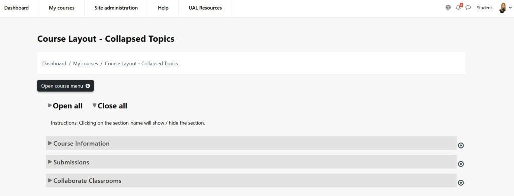
This format is similar to the standard Topics format except that all topics (except ‘0’) can be ‘toggled’ on and off. This reduces clutter in courses that have a large number of topics, lots of content in the topics or a combination of the two.
Set up
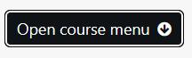
- Click Open course menu > Settings
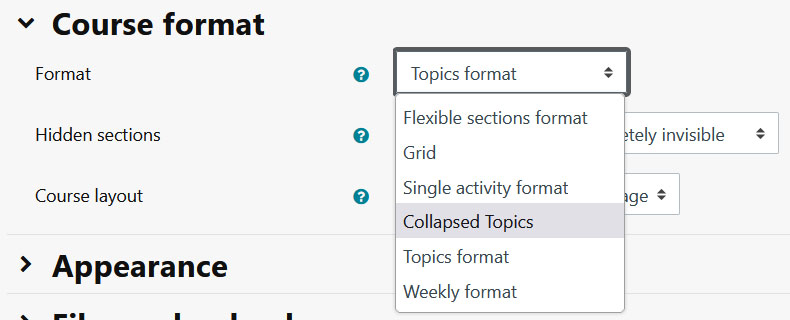
2. Expand Course format
3. Select Collapsed format from the dropdown
4. Display instructions – States that the instructions should be displayed to the user or not.

5. Elements – How much information about the toggles / sections you wish to be displayed.

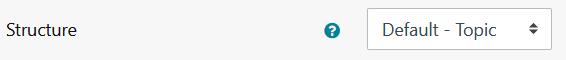
6. Structure – The layout structure of the course. You can choose between:
- ‘Topics’ – where each section is presented as a topic in section number order.
- ‘Weeks’ – where each section is presented as a week in ascending week order from the start date of the course.
- ‘Current week first’ – which is the same as weeks but the current week is shown at the top and preceding weeks in descending order are displayed below except in editing mode where the structure is the same as ‘Weeks’.
- ‘Current topic first’ – which is the same as ‘Topics’ except that the current topic is shown at the top if it has been set.
- ‘Day’ – where each section is presented as a day in ascending day order from the start date of the course.
7. Column orientation –
- Dynamic – Number sections per ‘row’ adjust to window size, ‘Column’ setting not currently used.
- Horizontal – Sections go left to right.
- Vertical – Sections go top to bottom.

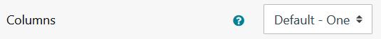
8. Columns – How many columns to use
9. Toggle all enabled – Toggle all functionality enabled

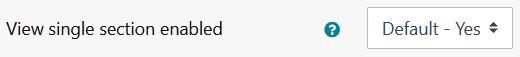
10. View single section enabled – View single section funtionality enabled
11. Toggle text alignment – Sets the alignment of the text in the toggle.

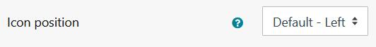
12. Icon position – States that the icon should be on the left or the right of the toggle text.
13. Icon set – Sets the icon set of the toggle.
14. Closed toggle icon font – When ‘toggleiconset’ is set to ‘Icon font’, this states the default CSS classes to use for the closed icon, i.e. see the FontAwesome icon classes. If set to ‘-‘ then the default is used.
15. Open toggle icon font – When ‘toggleiconset’ is set to ‘Icon font’, this states the default CSS classes to use for the open icon, i.e. see the FontAwesome icon classes. If set to ‘-‘ then the default is used.
16. One section – States if only one section should be open at any given time. Note: Ignored when editing to allow activities and resources to be moved around the sections.

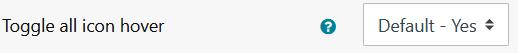
17. Toggle all icon hover – Sets if the toggle all icons will change when the mouse moves over them.
18. Toggle foreground – Sets the colour of the text on the toggle.

19. Toggle foreground hover – Sets the colour of the text on the toggle when the mouse moves over it.

20. Toggle foreground hover opacity – Sets the opacity of the text on the toggle between 0 and 1 in 0.1 increments.
21. Toggle background – Sets the background colour of the toggle.

22. Toggle background opacity – Sets the opacity of the background on the toggle between 0 and 1 in 0.1 increments.

23. Toggle background hover – Sets the background colour of the toggle when the mouse moves over it.

24. Toggle background hover opacity – Sets the opacity of the background on hover on the toggle between 0 and 1 in 0.1 increments.
25. Show the section summary when collapsed – States if the section summary will always be shown regardless of toggle state.
26. Click the Save and display button
Visual