Discover quick ways to enhance the accessibility of your Padlet boards. Scroll down to browse the tips or jump to specific sections by selecting an option from the list below.
Learn how to:
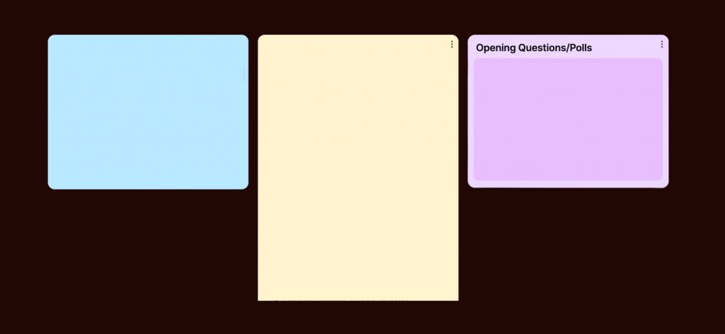
Organise Padlet spaces by using grid sections
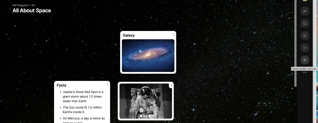
With the ability to create numerous boards and pieces of content on a single Padlet, there’s a risk of visual crowding, which can overwhelm users.
To counter this, organising the content into sections is key. This helps learners group information, making it much easier to absorb. By breaking everything into smaller groups of up to five or six information points, each section becomes more digestible and user-friendly.
This structured approach makes sure that your students can engage with the content effectively and without feeling overwhelmed.
How to organise sections on your Padlet board:
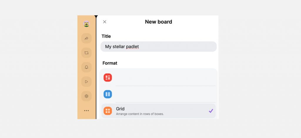
- Select ‘Grid’ under ‘Format’ in the ‘New Board’ menu. (The new board menu pops up when creating a Padlet from scratch.)
- Name your section.
- To add a new section, select ‘add section’.
How to organise sections on an existing Padlet board:
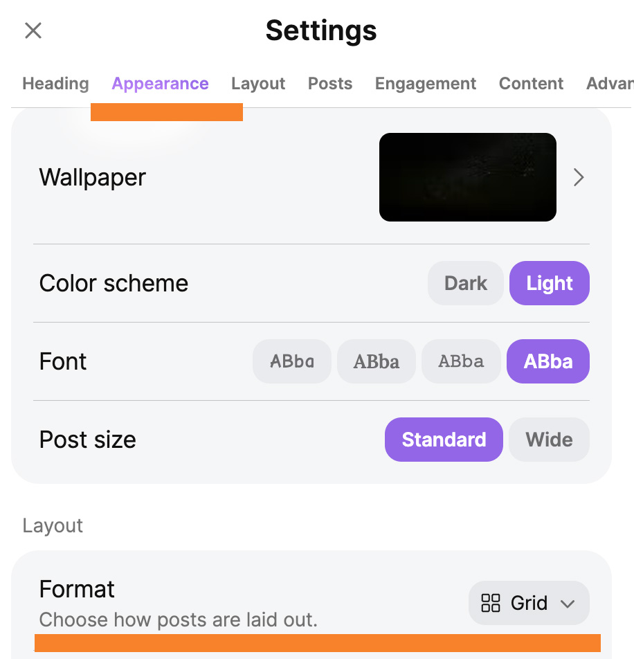
If you are trying to organise an existing Padlet into sections, you can achieve this by first selecting the gear icon on the right hand side of your Padlet board (pictured below)
After selecting Padlet settings, you then need to select the ‘Appearance’ tab and scroll down to ‘Format’ and select ‘grid’ from the drop down menu. Pictured below for context.
Reduce scroll fatigue by limiting Padlet width
Excessive scrolling on a Padlet board can be inaccessible, particularly for users with mobility, visual and cognitive difficulties, as it can be challenging to navigate and overwhelming to process.
To mitigate this, it’s best practice to use fewer boards and limit the width of your Padlet, reducing the need for extensive scrolling. This can be achieved by organising content into concise sections and utilising vertical columns instead of horizontal spread.
Reducing the need for scrolling makes the Padlet more navigable and accessible, enhancing the learning experience for all users. It allows learners to easily locate and focus on the content without feeling overwhelmed
Create Concise Sections: Break your content into smaller, manageable sections.
Use Columns Wisely: Opt for vertical columns rather than wide, horizontal boards. When setting up your Padlet, select formats like “Shelf” or “Stream” that encourage vertical organisation.
Limit the Number of Boards: Aim to keep the number of boards within a section to around 5-6 to maintain a digestible amount of information.
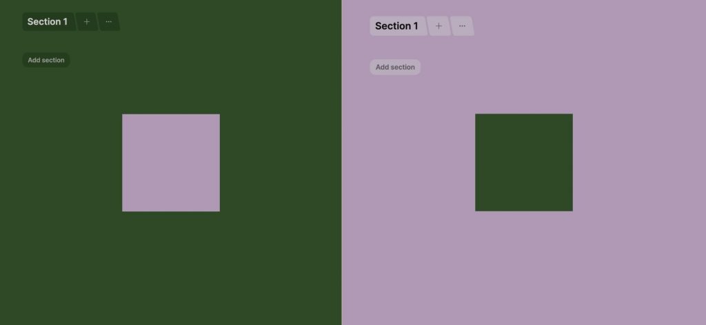
Colour coding for more easier navigation
Using colour to organise many pieces of information and separate them into categories can make it much easier to find what’s needed more quickly.
Adding different colours can make the learning environment more engaging and easier to navigate. Colours can highlight key information, mark different topics, or show the importance and urgency of tasks.
This helps reduce mental effort and improves memory and recall. Moreover, using colour can make the experience more accessible for learners with visual impairments or learning disabilities by providing clear visual cues.
How to change colours on your board:
- Select the three vertical dots to open the ‘edit’ tab.
- Choose a colour from the available section.
Use Presentation mode to reduce visual clutter

Presentation mode reduces a lot of the visual clutter by focusing on the main details, which is essential for accessibility. This mode presents images, text, polls, and other pieces of information in a way that reduces distraction, by focusing on each element one at a time.
This mode takes all the information in a post and presents them as a page.
Reducing visual overwhelm is beneficial for many, including neurodivergent learners, who may find excessive stimuli challenging to process.
This approach not only supports adherence to accessibility standards but can also make the difference between and positively impactful learning experience and a frustrating one.
How to use presentation mode:
- Select the three dots ‘more Padlet actions’ tab in the side panel.
- Select ‘Slideshow’.
- For full-screen, select the icon in the bottom right-hand corner.
Alternative: To start a slideshow from a particular board, select ‘Edit’ and then ‘Start slideshow from this post.’
Adjusting colours in Padlet for improved accessibility
Some of Padlet’s automated colour selections are quite muted and pale, which can make for a poorly contrasted, and thus – inaccessible, learning experience.
Ensuring accessible colour contrast is vital, as it makes content readable and navigable for all users, including those with visual difficulties.
To overcome these challenges, use resources such as Venngage to create accessible, high-contrast colour combinations for backgrounds and text. Click here to access the Venngage website.
You can reduce accessibility issues by opting for plain backgrounds. Titles can often get lost atop a busy background.
Adjust palettes by going to: Settings > Appearance to change the wallpaper and toggle between light and dark settings.
Padlet will provide alternative versions of each colour depending on whether you have light or dark mode activated.
How to adjust colours in Padlet:
- Access the ‘Settings’ from the side bar, represented by an icon of a gear.
- Look for the heading ‘Appearance’ and choose ‘Wallpaper’
- Select a wallpaper colour.
Additional steps to test contrast:
4. To test the colour contrast between background and text, you can use the Colour Contrast Analyser in UAL’s Self Service tool.
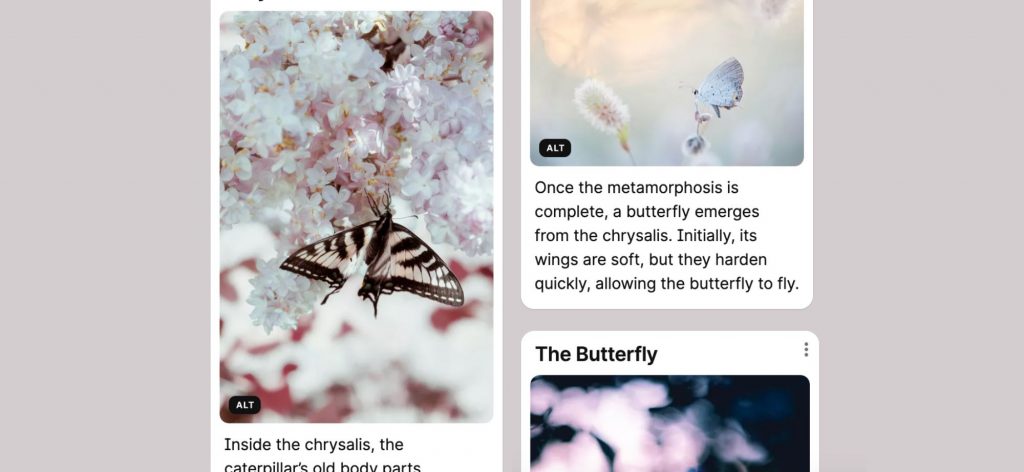
Write alt-text to help everyone get the full picture.
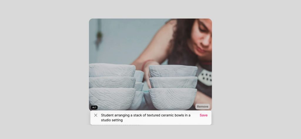
Adding alt-text to images supports students who use screen readers by providing a meaningful description of what the image shows or represents. This ensures everyone can engage with the content, regardless of how they access it.
Keep alt-text clear and concise, focusing on what’s important about the image. This provides useful context without overwhelming students.
Only include alt-text if the image adds value—such as supporting the learning or offering additional context. If the image is purely decorative, you can mark it as decorative so it’s skipped by screen readers.
How to write alt-text for images:
- Select the ‘edit’ icon on the top right-hand corner of the image.
- Go to ‘edit post’ from the pop-out menu.
- Select the ‘Alt’ button at the bottom of the image to write your alt-text.
Further Learning
Read tips to make your Padlets more accessible (web page)
Read Padlet’s accessibility FAQ’s (web page)