Technical Setup
Choose your style
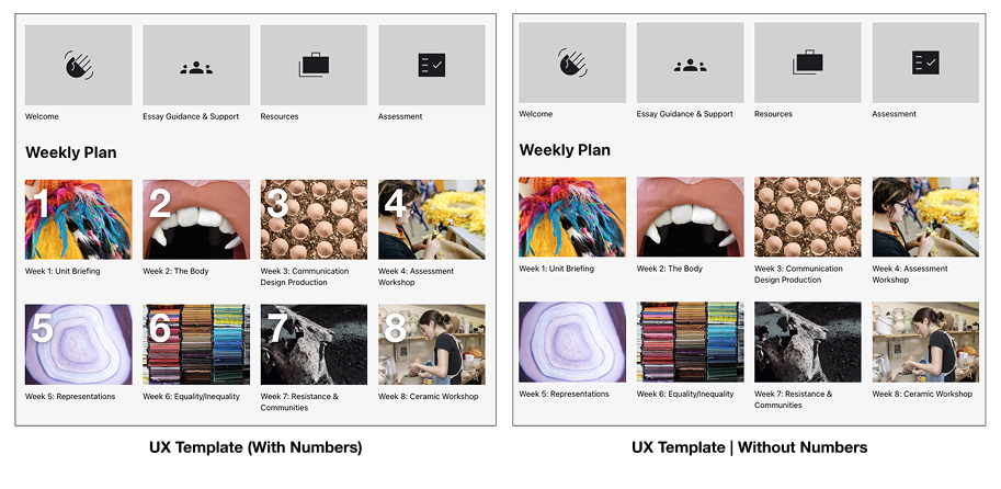
There are two versions to choose from. The standard template overlays numbers on your sections. Students agreed that having numbers made navigation simpler, especially when the course content was on a weekly basis. However, if numbered sections don’t work for your course, we have an option without.
Enable the style
In just a few simple steps, you can get our template enabled on your course.
- Go to Settings.
- Find Course Format
- Set the Format to Grid. If you want to quickly create many sections, you can now do that with the ‘Number of sections’ dropdown.
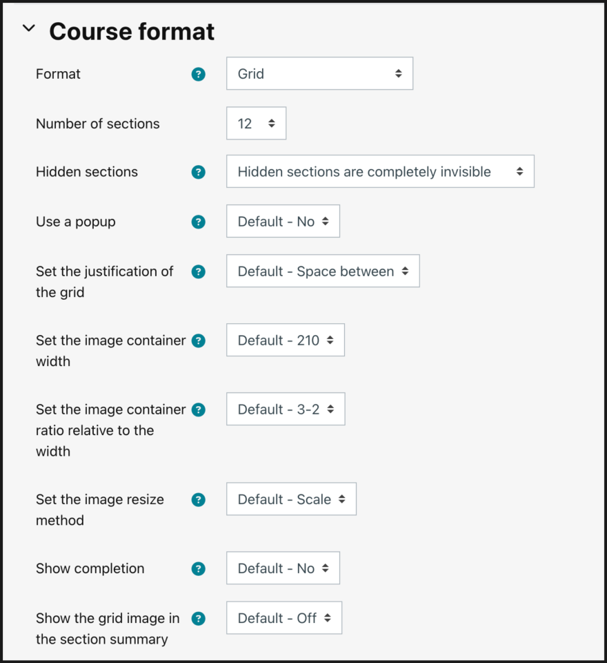
- Set the image container width setting to 448. This will ensure the images display clearly on all screens.
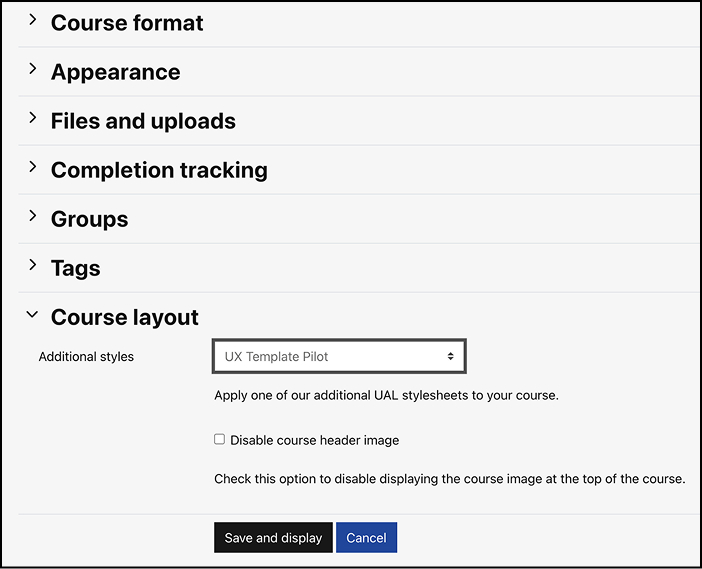
- In Settings, find Course Layout.
- Set the Additional Styles settings to ‘UX Template Pilot‘. This will load all of our custom styles for the new design. If you’d rather use our template without the numbers overlaying the section cards, choose ‘UX Template | Without Numbers’.
- Choose Save and display to access the new styles. Please note that you will have to exit edit mode for the sections display as a visual grid.
Adding a course image
It’s important to add a course image to help your students easily identify their units. It will appear in the header of the page and in course cards on Moodle landing pages (Dashboard and My Courses).
- Go to the course settings
- Find Course Image.
- Use the ‘Add file’ button to choose or upload an image.
We recommend choosing something related to the course as students use this image to navigate more easily. There are plenty of options in the UAL Image Library. Just login with your staff ID to begin browsing. You can use the Image Library guide for help.
Adding and removing sections
Your Moodle course page will be made up of several different sections. On the course ‘home’ page, there is a section displayed at the top (called section 0), and then each item in the grid links to a different section.
All sections will display stacked in Edit Mode, which means you can edit the content from any section from the same page. Switch off Edit Mode for the course to appear in a grid again.
Adding a section
To add a section:
- Switch on Edit Mode
- Hover your cursor between two sections and select the plus (+) symbol which appears in the centre.
- You can edit the section title by clicking within the title text or choosing the little pencil icon next to it. We recommend that you edit the section by selecting the 3-dot menu, then ‘Edit section’. In this edit page, you can set the section title, and, importantly, add a section image.
- In this edit page, you can set the section title, and, importantly, add a section image.
- You can also set up a section break, if this section should be a bit separate from the section before.
Accessibility tip: Minimise Sections
Why: Too many sections can confuse students and lead to frustration, as frequently reported in our research. Keeping only essential sections improves clarity and accessibility, making it easier for students to locate what they need without extra clicks.
Action: Limit sections to core areas that students need frequently, like “Resources,” and “Assessment.” Avoid creating additional areas of content with only one or two activities/items. Instead, consolidate similar items under broader, logically grouped sections.
Section title
Section titles should be short and clear for your students, but they will also depend on how you decide to structure the content on your Moodle course e.g. by week, or by topic. We have some recommendations about the way you use sections in our Organising your Course: Weekly or Alternative Sections guide.
Section image
We highly recommend adding an image to the sections you create in Moodle. In our research, we found that students appreciated images in their course to help them navigate, especially when the images were relevant to the learning. If you don’t have any images to use, you can check the UAL Image Library to see if there are some relevant images.
Accessibility tip: Avoid embedding text into the section images
Why: Not only can text inside images present contrast issues, it’s also unreadable by screen readers, making the content less accessible to students who rely on assistive technology.
Action: Place all clarifying information in headings, titles and text overlays instead of embedding into thumbnails or header banners.
Section break
We recommend separating general course sections (the first row of images) from weekly teaching sections (numbered grid images below). Even if the course content isn’t in weekly sections, a separator can help users navigate around the page.
How to add a separator
- Go to Edit section for the section you want to start on a new line.
- Find Section break.
- Set it to Yes. This will create a break before this section.
- To set a heading, we recommend using a short HTML snippet:
<br><h2>Weekly Plan</h2><br> This turns the separator into a heading, which is visually clearer and also helps screen readers navigate the page. It also adds some spacing above and below the heading.
If you want a break in the grid without a heading, we recommend you to add just one line break:
<br>Section order
We have found that students struggle with the lack of consistency between different Moodle courses and not knowing where things are. Many units and courses choose to include some unit-wide information before their weekly/thematic learning sections. We recommend that if you have this kind of content, that you put it at the top (in the first few sections) and that you use our standardised set of icons. See image above for an example of the standard top row of content.